blog post
Mastering Moods: A Guide to Choosing the Perfect Color Palette for Your Home
As soon as a person enters a dwelling, the eye is drawn to color before it notices furniture, light, or ornamental pieces. The color of the walls, the accents, and the tones used in every room innocently predetermine the atmosphere that follows; some interiors give an immediate impression of comfort, others an impression of grandeur or liveliness. These effects are not accidental — color has a direct impact on human emotion, and mastering moods through the restrained choice of a suitable palette can serve as a guide to transform a mere space into a statement of personality, lifestyle, and comfort.
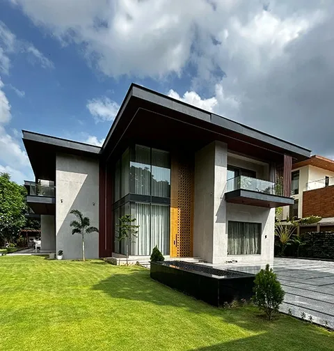
Interia is a top interior design company in Gurgaon, which has witnessed with its own eyes the power of wise color selection that can transform living environments. Regardless of whether the occupant prefers the peaceful tranquility of the pastels, the contrasting drama of a strong color scheme, or the timeless grace of neutrals, the selected scheme will say a lot about the person.
In this blog, Interia provides recommendations on how color influences mood, tips on how to choose appropriate shades in each room, case studies, and an understanding of how working with luxury interior designers in Gurgaon can make the process more effective.
Why Color is More Important Than You Realize
Take your favorite cafe. Warm lighting and grounded colors usually encourage customers to stay at least several hours. Compare that to a vibrant coworking office--yellows, whites, and splashes of blue to stimulate. This is a manifestation of the psychology of color.
- Warm colors (reds, oranges, yellows) are generally invigorating and encourage communication.
- Cool colors (blues, greens, purples) relax and are soothing.
- Whites, grays, and beiges (neutrals) balance and offer a flexible background.
The main aspect of success is to find the right balance based on the purpose of the room.
The Trick to Choosing the Best Palette per Room
Every room has its energy, and the palette would have to suit the purpose of the space as well as the emotions to be felt. The best practices can be described as follows:
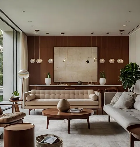
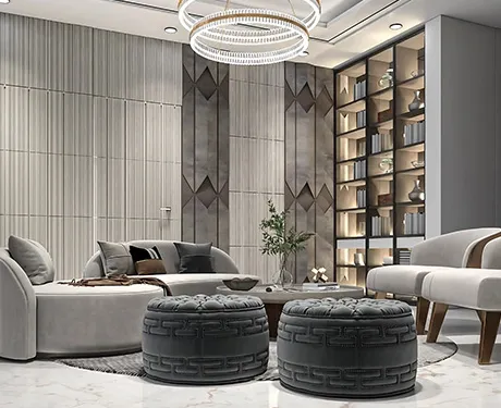
1. Living Room: A Generous Ambience
The living room plays the role of family interaction, social events, and most entertainment. It is best to choose a palette that will sound warm, but also varied.
- Real-life scenario: A family in Gurgaon, who wanted to host, chose earthy taupe walls with muted gold highlights, and a deep blue accent showing up on cushions and paintings. This outcome was welcoming and prosperous.
2. Dining Room: Comfortable and Communication Place
Dining rooms do not need a color scheme that is too eccentric. Several solutions can be used depending on the size of the room, including neutral tones, soft pastels, or subtle bold hints.
- Real-life scenario: A small dining room in Gurgaon was designed with light gray walls and light green trims, which formed a tranquil yet functional environment suitable for intimate dinners.
3. Kitchen: An effective and functional Place of Work
The kitchen must have neutral colors that allow visual clarity and provide ease of navigation and efficient functioning.
- Real-life scenario: A modern Gurgaon kitchen had clean white cabinets on a light gray background, with sleek silver fixtures that were simple enough to add to functionality, without harming the outlook.
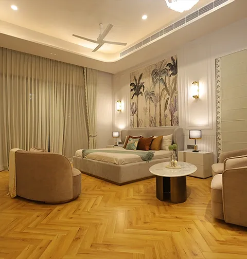
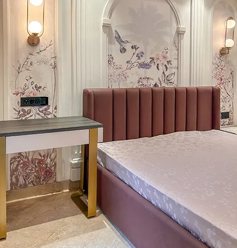
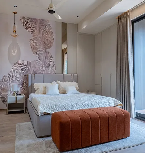
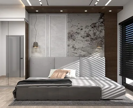
4. Bedroom: A Rest and Relaxation Retreat
A bedroom must promote healing sleep and healing restorative sleep. This is frequently reached with cool colours such as blues, greens, or purples.
- Real-life scenario: A home in Gurgaon had a parent suite with deep blue walls paired with textured plums, creating a visually calming effect that promoted relaxation.
5. Children's Room: Fun but Functional
It is no wonder that one would be tempted to use bright and bold colors in the space occupied by a child, but these colors will quickly fade away.
- To make the effect more lasting, use lighter hues that are suggestive of playfulness.
- Chalkboard paint on walls, or pastel colours with colourful furniture, allows gradual change as the child grows.
Advice to Prevent the Most Common Color Errors
- Neglecting Lighting: A color that looks brilliant in a showroom can look dull in the varying light of your rooms. Look at swatches in both natural light and artificial light and then decide.
- Excess Bold Shades: Too much of intense colors is perfect as embellishment; a red room decorated in monotone colors may be depressing instead of exciting.
- Missing the Flow: Unrelated rooms are not supposed to have a visible relationship. In a nutshell, should your living room be characterized by warm neutrals, use a complementary color in the adjacent dining room.
- Ignoring Finishes: Finishes may be glossy, matte, or textured, and all can make a big difference in how color is perceived. Determining the type of finish to use before painting.
The Reason to Hire Luxury Interior Designers in Gurgaon.
Selecting colors can seem like an easy task, but this soon becomes overwhelming in front of the hundreds of color swatches, combinations, and finishes. Experts offer insightful advice.
- Professional understanding: Qualified designers understand how lighting, furniture, and finishes affect the perception of color.
- Tailored palettes: Such specialists will develop schemes based on your lifestyle and identity.
- Stress-free implementation: They get the right paints, make a perfect implementation, and match the palette with the furniture and decor.
Our luxury interior designers in Gurgaon use both aesthetic sensitivity and color psychology at Interia. Serenity or drama, the palette is aligned with the energy of your home and your hopes.
Practical Steps to Select Your Color Scheme
1. Prepare a mood board- gather inspiration on Pinterest, magazines, or even in nature.
2. Choose an overpowering base color for the walls.
3. Use secondary colors on furniture, curtains, or rugs.
4. Complete with accent shades to cushions, art, and decor.
5. Extensively test swatches, especially on the four walls, and see how light changes tone.
Final Thoughts
The color scheme of a home goes beyond the aesthetic dimension; it establishes the atmosphere, reflects individuality, and determines coziness. Depending on the right shades, it is possible to make a small room look spacious, a house a warm nest, and a simple apartment a high-end villa.
Although there is no magic bullet, teaming up with professional interior designers in Gurgaon, like Interia, will help you make your home tell the story you want to be told.
Ready to transform your home with the perfect color palette? Let Interia help you craft spaces that don’t just look beautiful but feel right. Get in touch with our team of luxury interior designers in Gurgaon today, and let’s design a home that truly reflects your personality.
FAQs
Q1. How do I choose the right color palette for a small home?
Opt for lighter shades like whites, creams, and pastels to make the space feel bigger and brighter. Add pops of color with cushions, rugs, or art.
Q2. Can bold colors work in luxury interiors?
Yes, when used strategically. Luxury interior designers in Gurgaon often balance bold tones with neutrals to avoid overwhelming the space while still adding drama and personality.
Q3. What’s the safest color choice if I’m unsure?
Neutral palettes such as beige, taupe, or soft greys are timeless, versatile, and pair well with almost any décor style.
Q4. Do professional interior designers really make a difference in color selection?
Absolutely. Experienced interior designers in Gurgaon, like Interia, consider lighting, room size, furniture, and mood before finalizing a palette, ensuring long-lasting results.